 Making Your TV Viewing Experience More Personalized Than Ever Before
Today, consumers are streaming more than ever. Interested in cooking shows on-demand? Or want to subscribe to live TV only during baseball season? That choice and flexibility is now possible for viewers, and that’s all thanks to streaming.
With our growing audience, we’re constantly thinking about creating the best possible experience for our viewers, by getting them to the content they want to watch quickly while also helping them discover their next favorite movie or series to binge. We listened to feedback from our viewers and heard they loved how easy it was to continue watching the shows and movies they love, but not as easy to discover new content.
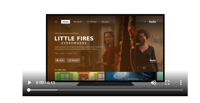
That’s why today, we’re announcing some changes to our experience which will be available to some viewers on Roku and tvOS devices beginning today and roll out more broadly over the next few months.
Making Navigating Collections Easier
Viewers can now navigate through collections vertically and explore within a collection by moving horizontally. This navigation pattern is something our viewers are accustomed to and matches the navigation pattern across Disney+ and ESPN+, making it easier for viewers who subscribe to the Disney bundle to switch between services and navigate with ease. When testing, viewers found it easy and intuitive to adjust to this updated navigation pattern.
We’re also simplifying navigation. Categories of content like TV, Movies, and Sports will be moved to the master navigation, which gives our viewers a clear pathway to find what they’re looking for. In the mood for a dramatic movie? This new navigation provides an easy way to navigate our vast library of content with fewer clicks than before.
Communicating More Information Through Tile Size
Our new collection trays will continue to showcase content in a focused way while also using tile size as another way to communicate information. For example, new shows or movies we know you won’t want to miss will be larger in size. “Keep Watching” tiles however may be smaller, so viewers can see more of their titles at a glance and quickly return to their favorite shows with less clicks.
More Personalized Collections by our Content Experts and Recommendation System
We’re always working on bettering our recommendations to help you discover more, faster. In addition to changes to the Hulu user experience, we’ve also made some backend changes to improve the way our recommendations work.
Since Hulu launched, we knew it was incredibly important to have human editors surfacing content, in addition to smart algorithms identifying the next binge-worthy series for you to watch.
Starting today, our team of content experts and recommendation system work even more closely together, with our recommendation system fine-tuning curated collections so they are more personalized for our viewers.
With this change, a viewer who may be a fan of medical dramas will see those titles first in a curated drama collection. In that same collection, a fan of romantic dramas may see those prioritized instead.
These updates to our UI, paired with more powerful expert and algorithmic curation, make Hulu’s content discovery and navigation experience easier to use and more personalized than ever before. These changes are just the first step in many more to come, all aimed at creating a user interface that puts our content and viewers at the forefront of the experience.

