 The shape of your logo affects how consumers perceive your organisation, its products and even its behaviour.
While they’re commonly called “intangible assets”, logos matter. GAP learned this lesson when it attempted to change its logo, but quickly abandoned the endeavor after it met with a furious backlash from followers on Twitter and Facebook. The fact that GAP had suddenly decided to update its iconic and classic logo without consulting its loyal fans was just one reason for its failure.
What the retailer hadn’t realised was how the subtle aspects of its logo were perceived and how a complete revamp might affect those perceptions.
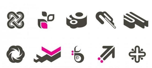
As my colleagues and I point out in a new paper, a logo’s shape can affect the judgments people make about the attributes of a company or product. Specifically, we find that circular or angular logos activate associations of “softness” and “hardness” respectively.
These associations extend beyond physical notions of softness and hardness. For example, if a person is reading an ad for a services company, the notion of softness may give the reader the image of the company as being more sensitive to its customers.
How do you want to be perceived?
We took this further by presenting an ad for a specific product, in this case a sports shoe, to see whether the effect of the logo’s shape influenced perception of a specific product. We found that the circular logo led to perceptions of comfortableness, whereas the angular logo led to perceptions of durability. In another experiment to solidify these findings we used a different type of logo with sofas as the product category, which had the same effects, with consumers associating the sofas with softness if a rounded logo was present and hardness when an angular logo was present.
Shaping perceptions
While logo shape has a big part to play in consumer perception, it can also be accentuated or reduced by accompanying visual imagery in an advertisement. This is due to how mental imagery is processed by the recipient. Generation of mental images happens in what psychologists call the visuospatial sketchpad of working memory. This sketchpad can be constrained if opposing visual imagery or ad headlines differ from the inference drawn from the logo shape.
On the other hand we found that ad headlines affected a different part of working memory (the phonological loop, responsible for speech-based and numerical information), but with similar outcomes. In our shoe ad, we found that the attributes of circular or angular logo shapes were made more noticeable if the headline of the ad reflected similar attributes. This effect was also diminished when the headline focused on other aspects. In our shoe ad for instance, the logo shape’s effect on comfortableness was accentuated with a headline that illustrated comfortableness, but this effect was diminished when the ad headline focused on durability. It’s no wonder advertising guru David Ogilvy described the headline as 80 percent of the ad.
We also found that consumers had a higher willingness to pay for the product if the logo shape inferences were consistent with the verbal information of the ad.
What logos say about your firm’s behaviour
We also investigated whether these findings could be taken beyond physical product perceptions and into the realm of general brand characteristics, including the behaviour of company employees. Participants in one experiment were shown the scenario of a passenger carrying overweight baggage trying to board a plane operated by a company with either a circular or angular logo. They were asked how likely the passenger was to be allowed to board without a penalty. As expected, participants reckoned the airline would be more likely to allow the passenger to bring their bag on board without a penalty if it had a circular logo. They also thought the airline would be more willing to respond to customer needs and cared more about its customers if it had a circular logo.
Picking your shape
So how does a company decide on the shape it will use for its logo? Designers are taught that circles are graceful and their curves are seen as feminine, warm and comforting. Angular shapes on the other hand represent order, rationality and formality. This guidance, however, is very general. In a business context, organsiations have multiple motivations at play and the implicit messages in logos can be accentuated or reduced depending on the desired behaviour the organisation is trying to influence.
As we noted in our earlier experiments, we exposed people to shapes before actually asking them to carry out a specific task with regard to a logo. We found that even this exposure has the same effect. This holds important implications not just for logo design but also for companies designing display spaces or even products or packaging; the bottom line being that if an organisation wants to be perceived as rugged, durable and tough, an angular logo will work best, but for those who wish to be seen as caring and soft, a circular logo is for you.
Authored by Amitava Chattopadhyay, INSEAD Professor of Marketing
Source:INSEAD

