 A new YouTube look that works for you
When YouTube launched 12 years ago, it was a single website that supported one video format, 320×240 at 4:3 aspect ratio. Fast forward to today, and YouTube lets you watch any combination of SD, HD, 4K, 360, 3-D, and live video on nearly every device with an internet connection – from desktops to phones, tablets to TVs, game consoles, and even VR headsets.
We’ve also introduced apps and services that give you new ways to watch and get even closer to the content and creators you love. Music fans, gamers, and TV lovers each have unique experiences specifically tailored for their favorite content with YouTube Music, YouTube Gaming and YouTube TV. For families looking for the best way to watch together, we launched the YouTube Kids app. And for fans who want an uninterrupted, ad-free experience, and exclusive original content from creators, there’s the YouTube Red membership.
To put it simply, YouTube’s evolved … a lot. And we’re not even close to done. Over the last few months we’ve started releasing updates and will continue to throughout the rest of the year. When all is said and done, we’ll bring a new level of functionality and a more consistent look across our desktop and mobile experiences.
Let’s start with the YouTube mobile app, which is getting a bunch of new features:
Clean new design: We’ve made the header white to let content take the lead and moved the navigation tabs to the bottom of the app so they’re closer to your thumbs. We also added new Library and Account tabs that give you easy access to what you’re looking for.
Videos that move with you: One of the things we’re working on is bringing gestures to YouTube. Earlier this year, we introduced a gesture that allows you to double tap on the left or right side of a video to fast forward or rewind 10 seconds. Give it a try! We already see billions of double taps per day. And I wanted to give you a sneak peek at another gesture I am really excited about. In the coming months, we’ll experiment with a feature that lets you jump between videos with a simple swipe of your hand: just swipe left to watch a previous video or swipe right to watch the next one.
Watch at your own pace: Users love that they are able to speed up and slow down the playback of a video on desktop, and we’re excited to bring this feature to the mobile app today, so you can enjoy videos at whatever speed you prefer.
Adapt to any video, beautifully: We’ve also been experimenting with new ways to display all videos in the best possible way. Soon, the YouTube player will seamlessly change shape to match the video format you’re watching, such as vertical, square or horizontal. That means you’ll always get the best viewing experience automatically – including vertical videos with no black bars on the sides!
Browse and discover while you watch: We recently added a feature that lets you view a row of suggested videos while you’re watching in full screen. We’re also working on transforming the area below the player so you can browse videos in totally new ways.
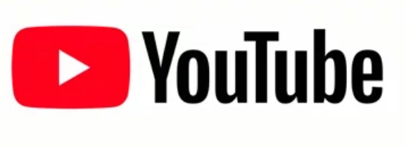
The bright red cherry on top of this update sundae is a refreshed YouTube Logo and YouTube Icon. Designed for our multi-screen world, the updated Logo combines a cleaned up version of the YouTube wordmark and Icon, creating a more flexible design that works better across a variety of devices, even on the tiniest screens. Why’s it more flexible? When room is limited (say on a smartphone) you can use the brightened up Icon as an abbreviated Logo, which will be seen more easily and read more clearly. You’ll see the new Logo and Icon roll out across mobile and desktop today, and across all our other apps and services soon.
We know this is a lot of change, but we want to make clear that there’s one thing that stays the same: YouTube’s mission. We’re here to give people a voice and show them the world – no matter what device they use.
Source:YouTube Blog

