 Today we’re introducing a new look. You’ll see an updated icon and app design for Instagram. Inspired by the previous app icon, the new one represents a simpler camera and the rainbow lives on in gradient form.
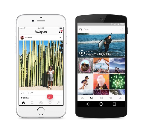
We’ve made improvements to how the Instagram app looks on the inside as well. The simpler design puts more focus on your photos and videos without changing how you navigate the app.
The Instagram community has evolved over the last five years from a place to share filtered photos to so much more — a global community of interests sharing more than 80 million photos and videos every day. Our updated look reflects how vibrant and diverse your storytelling has become.
Thank you for giving this community its life and color. You make Instagram a place to discover the wonder in the world. Every photo and video — from the littlest things to the most epic — opens a window for people to broaden their experiences and connect in new ways.
Designing a new look for Instagram, inspired by the community
Inspiration
When Instagram was founded over five years ago, it was a place for you to easily edit and share photos. Over those five years, things have changed. Instagram is now a diverse community of interests where people are sharing more photos and videos than ever before, using new tools like Boomerang and Layout, and connecting in new ways through Explore.
Last year, a group of us started digging into how we could support this evolution while staying true to Instagram’s heritage and spirit. We wanted to create a look that would represent the community’s full range of expression – past, present, and future.
Challenge: Honor Instagram’s identity while reflecting its growth
Whether it’s a #myinstagramlogo art piece or an Instagram cake, we feel so lucky to have a logo that people love and want to make their own. Between the round shape with grippy textures, teddy-bear brown, a candied lens, and even a rainbow, there’s a lot to hold on to.
Brands, logos and products develop deep connections and associations with people, so you don’t just want to change them for the sake of novelty. But the Instagram logo and design was beginning to feel, well… not reflective of the community, and frankly we thought we could make it better.
Let’s Begin
Our initial explorations involved trying to modernize the classic icon as-is. We started with the basics, removed ornamentation, and flattened the icon. And we arrived at a brighter, flatter option — but was it better? Would we feel the need to do this again in a year?
These early “flattening” explorations lacked the visual weight of the original. The skeumorphic style that dominated early versions of iOS has the benefit of giving icons solidity. Things felt tangible, despite being pixels.
But just flattening an icon wasn’t the answer. We needed to figure out exactly what people loved about the classic icon, and start there. Anecdotally, we knew that people loved the rainbow and the camera lens was a key visual element. As a part of our process we also asked people at the company to draw the Instagram logo from memory in 5 seconds. Almost all of them drew the rainbow, lens, and viewfinder.
With this insight, we decided to translate these elements into a more modern app icon that strikes a balance between recognition and versatility.
Solution: The rainbow and camera lens as a bridge
Color
If the lens is a bridge into the bolder, simpler glyph, the rainbow is a bridge into the colorful gradient. Color has always been a huge part of Instagram – you see it in the classic app icon, filters, and the community’s photos and videos.
When we started reimagining the rainbow, we looked at more minimal options. But ultimately we needed more warmth and energy to complement the glyph.
Glyph
We realized we needed to move past a rendered camera to get a flexible, scalable glyph, but the previous glyph proved to be a weak basis for an icon. To maintain the previous icon’s gravity, we had to figure out how to give the new mark more character while also removing what was unnecessary.
The question then became, how far do we go? If you abstract too much, the glyph doesn’t feel tied to the history and soul of Instagram. If you make it too literal, it’s hard to justify changing from what we currently have.
After a lot of refinement, we landed on a glyph that still suggests a camera, but also sets the groundwork for years to come.
One visual identity
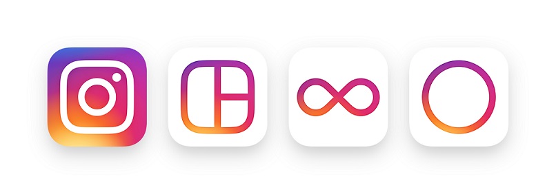
Our family of apps – Layout, Boomerang, and Hyperlapse – also have a new, unified look. We carried the gradient through each icon, and designed them on the same grid to make the system feel cohesive. We also updated the Layout and Boomerang icons to better represent what the apps help you create – a composition of photos, or a mini video that loops forward and backward.
New UI
Around the same time we started rethinking the logo, we began iterating on the UI, working to create something simple and clean that makes people’s posts the focus in the app.
While the logo is a colorful doorway into the Instagram app, once inside the app, we believe the color should come directly from the community’s photos and videos. We stripped the color and noise from surfaces where people’s content should take center stage, and boosted color on other surfaces like sign up flows and home screens.
As we reduced color and noise in the UI, we saw interaction patterns that no longer felt native on iOS and Android devices. By paring down the new interactions and using standard iOS and Android components, fonts, and patterns, people will be navigating familiar terrain. We also redesigned our icons in a way that feels at home on Android and iOS.
Looking ahead
The evolution of the community has been inspiring, and we hope that we’ve captured some of the life, creativity, and optimism people bring to Instagram every day. Our hope is that people will see this app icon as a new creative spark — something to have fun with and make their own. We’re excited for where this will take us.